
Aligned Aura Edit
Health + Wellness
Category
Branding
Project Type
2026
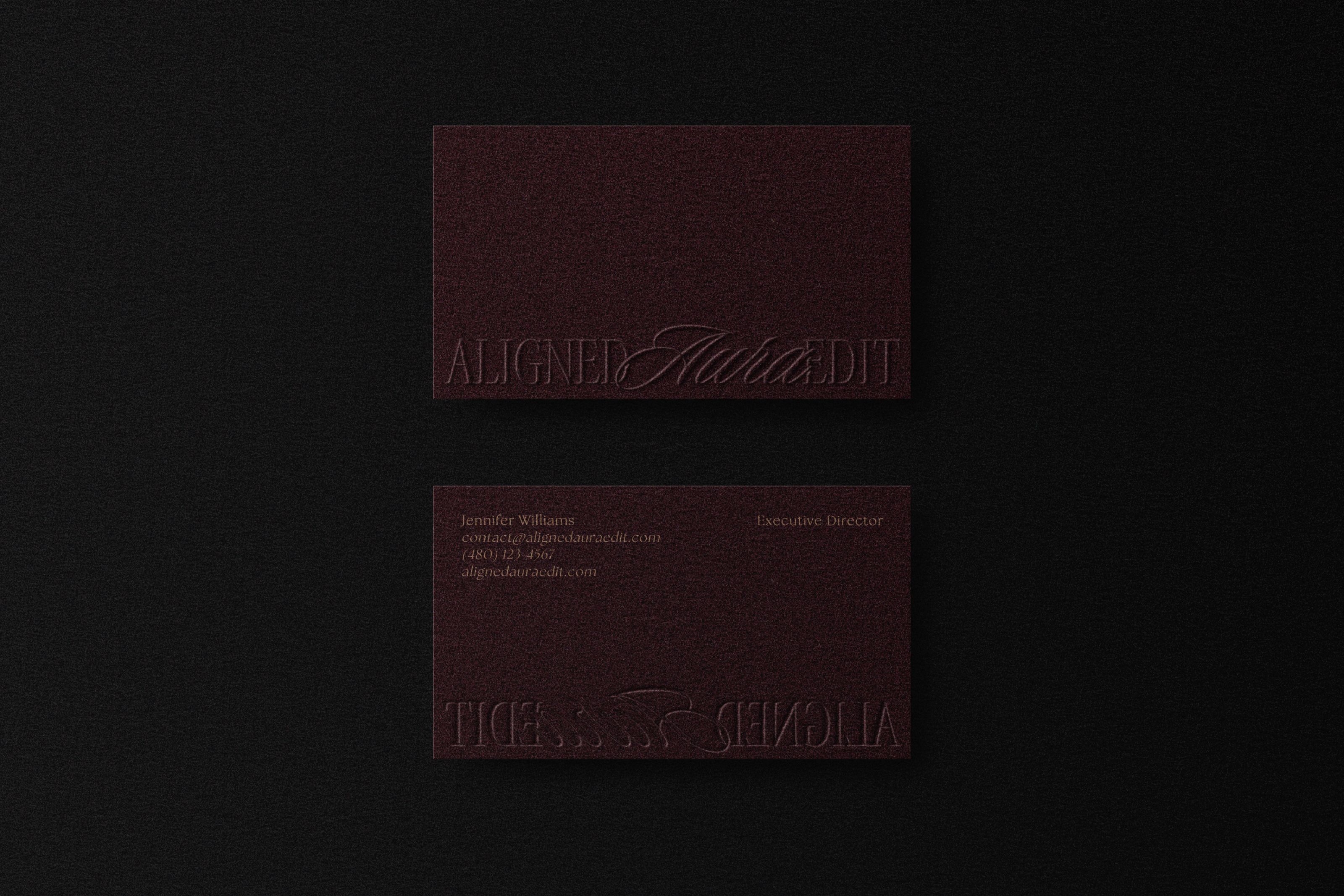
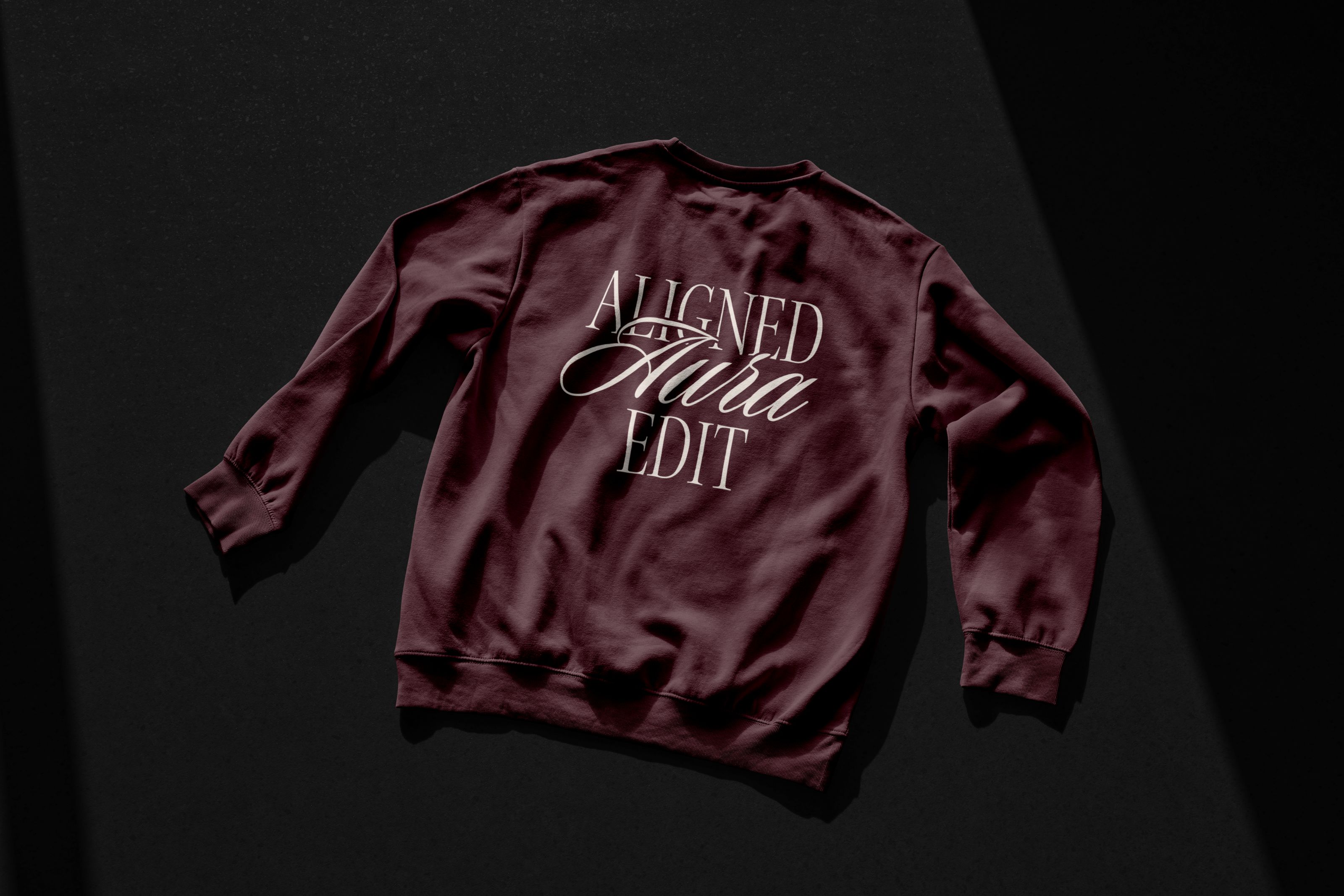
The identity reflects this through a balance of structure and flow. The wordmark pairs a grounded serif with a fluid script to mirror stability and intuitive movement. The oval mark represents the aura as a contained, evolving energy field, while the internal lines suggest realignment and personal transformation. The star acts as a point of clarity and direction. Paired with deep, rich tones, the overall design expresses quiet luxury, depth, and a calm, confident presence.
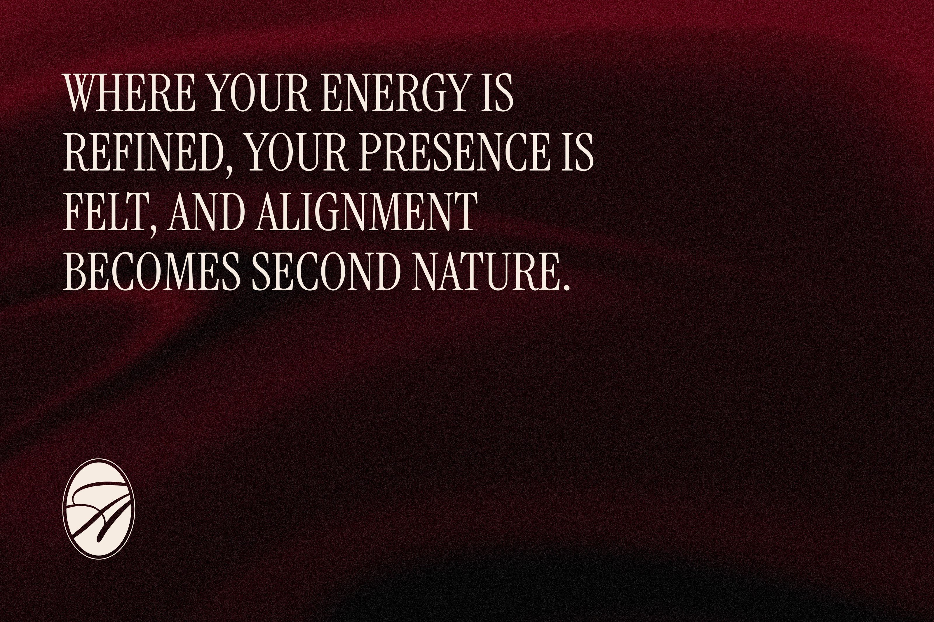
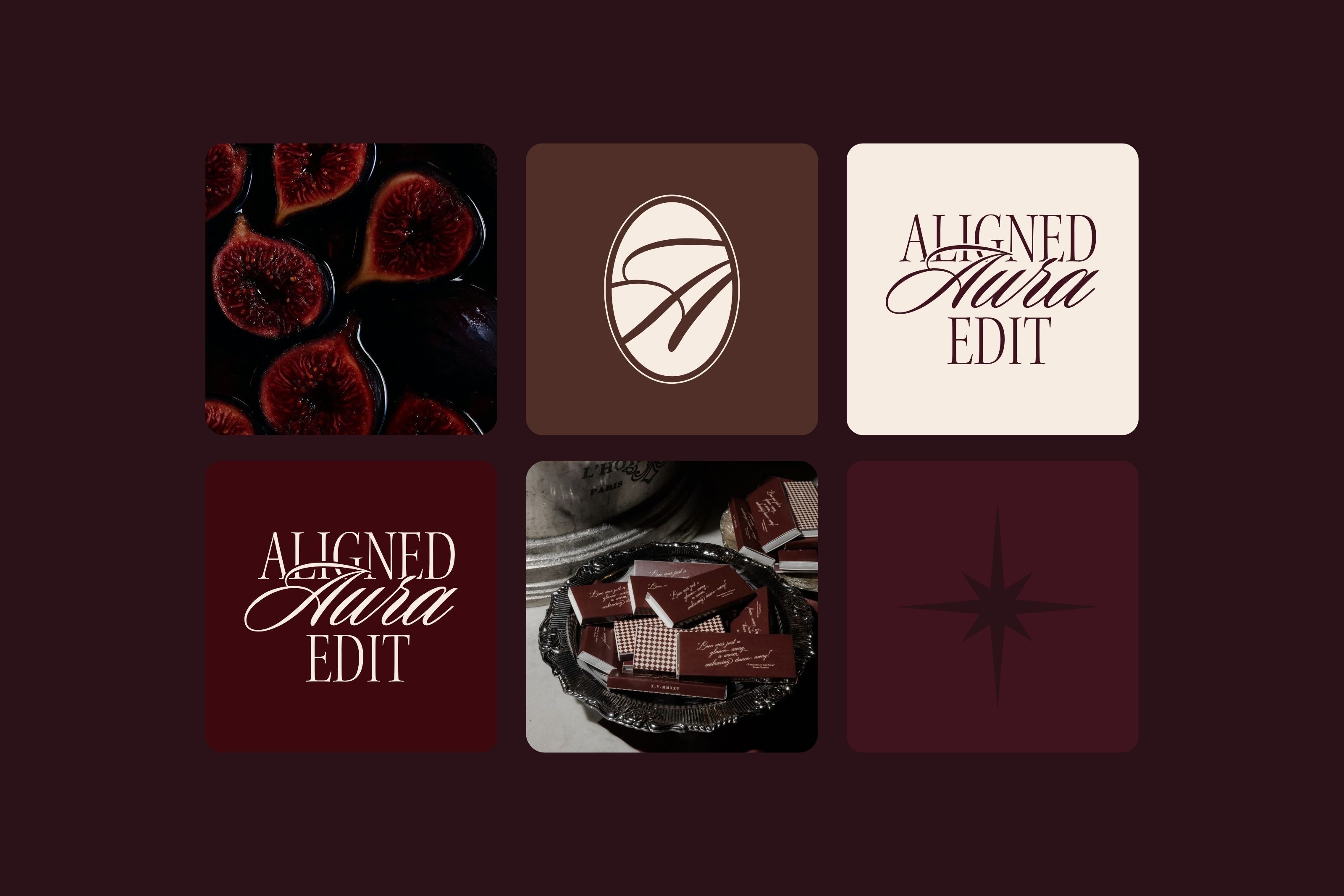
Aligned Aura Edit is a refined space for energetic alignment, guiding you to release what no longer resonates and step into a clear, grounded, and magnetic version of yourself. Rooted in intention and subtle transformation, it elevates alignment into a way of being.
Client [Client Name] Year 2023 Services Branding, Campaign, Digital, Packaging Typefaces [Font Name] by [Company name] Credits [Name] (Creative Director) [Name] (Design) [Name] (Photography) [Name] (Web development) [Name] (Copywriting) [Name] (3D)
Hungry for more?